88 China CAfe
A complete brand refresh and menu redesign for a family owned Chinese take-out restaurant, focused on improving readability, visual hierarchy, and customer engagement.
Role:
Concept development, visual identity design, menu layout and hierarchy, logo creation, and collateral production using Adobe Illustrator and Adobe InDesign.
Tools:
Adobe Illustrator, InDesign
-
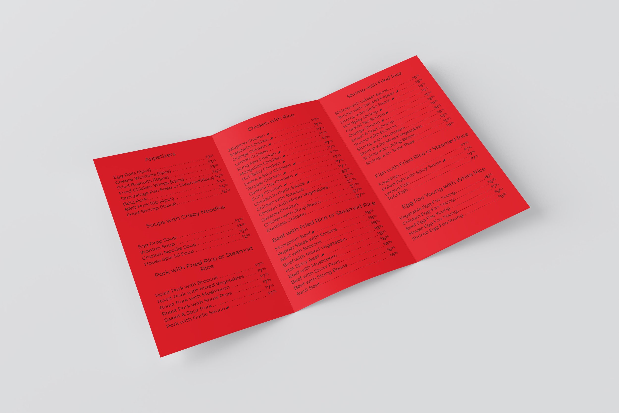
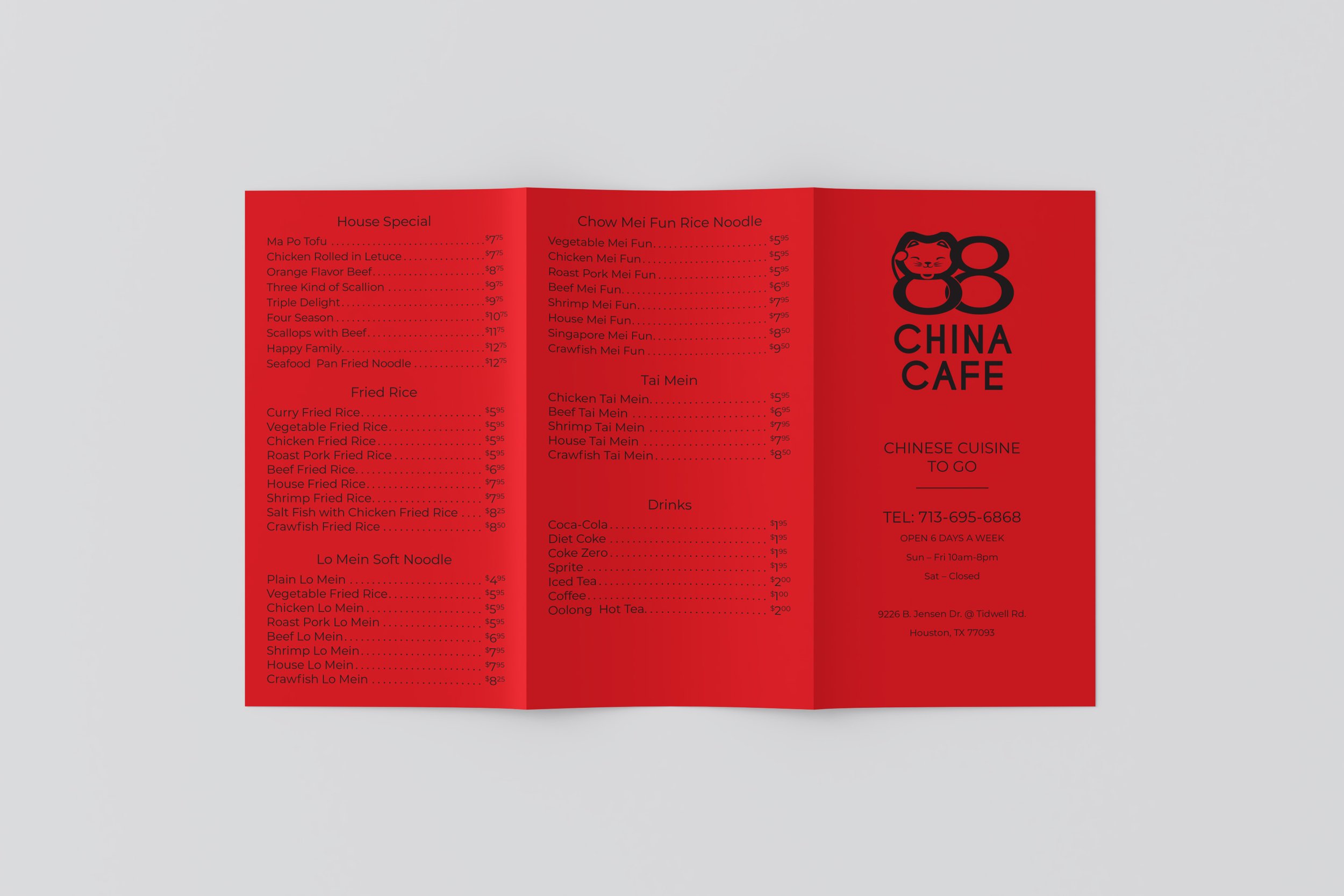
The original to-go menu was cluttered, text-heavy, and hard for customers to scan quickly. There was no cohesive brand identity, which made it difficult for the restaurant to stand out from competitors and communicate its offerings clearly.
-
Simplify the menu layout to improve clarity and readability, introducing clear sectioning and typographic hierarchy. Develop a unique visual identity rooted in the restaurant’s cultural context to strengthen brand recognition across both printed and environmental materials.
-
Redesigned the menu with clean organizational structure, clear headings, and whitespace to reduce visual clutter.
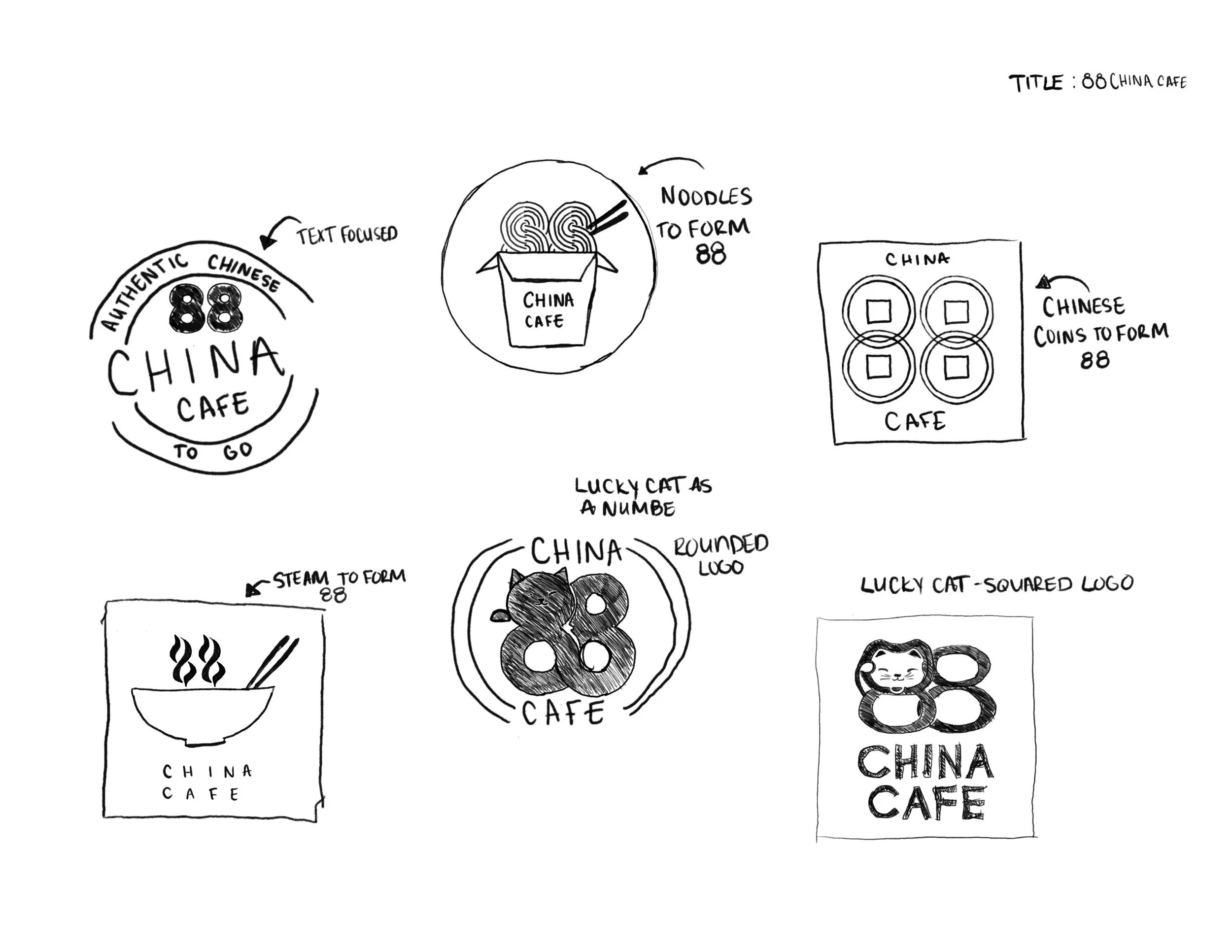
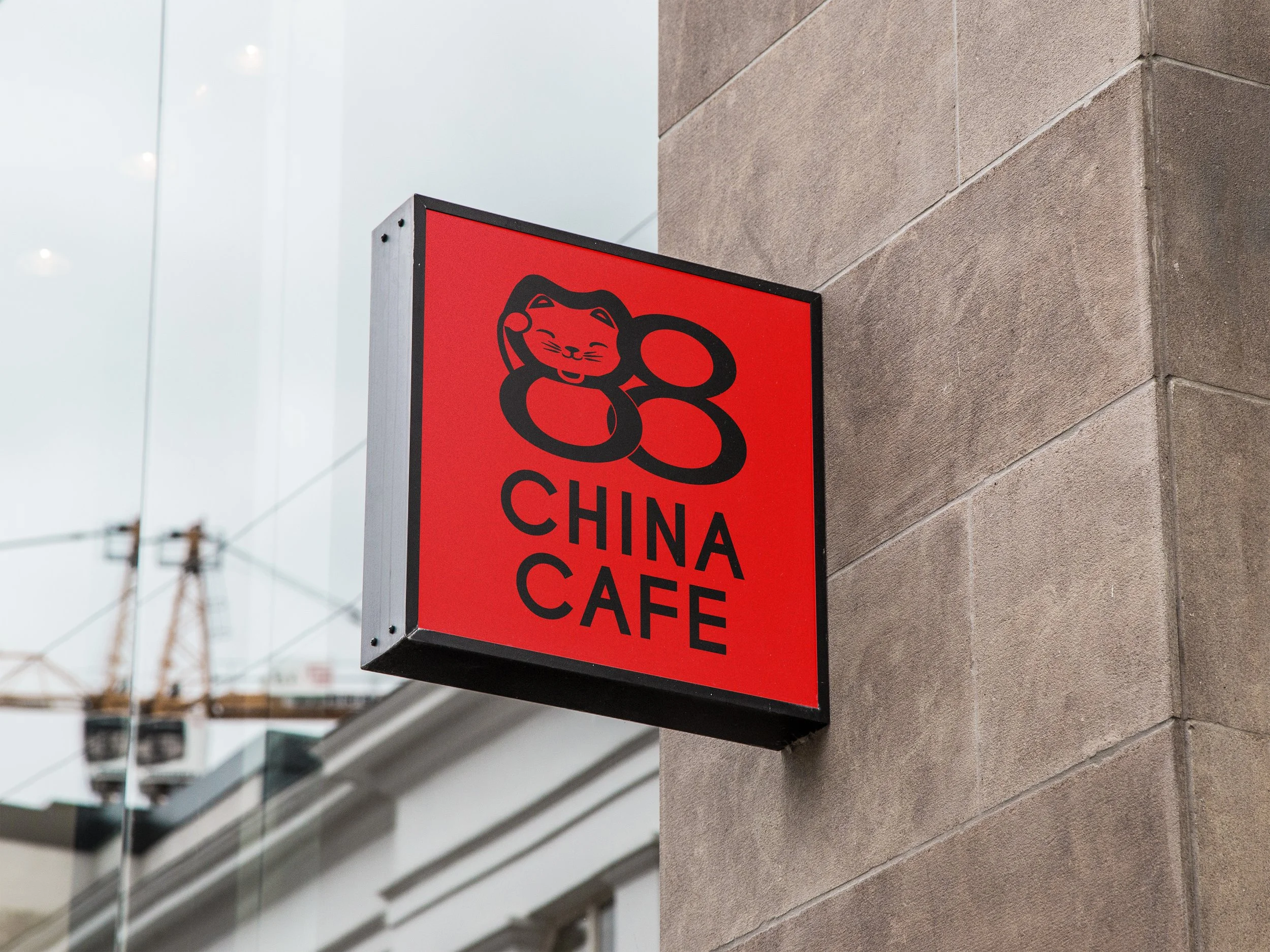
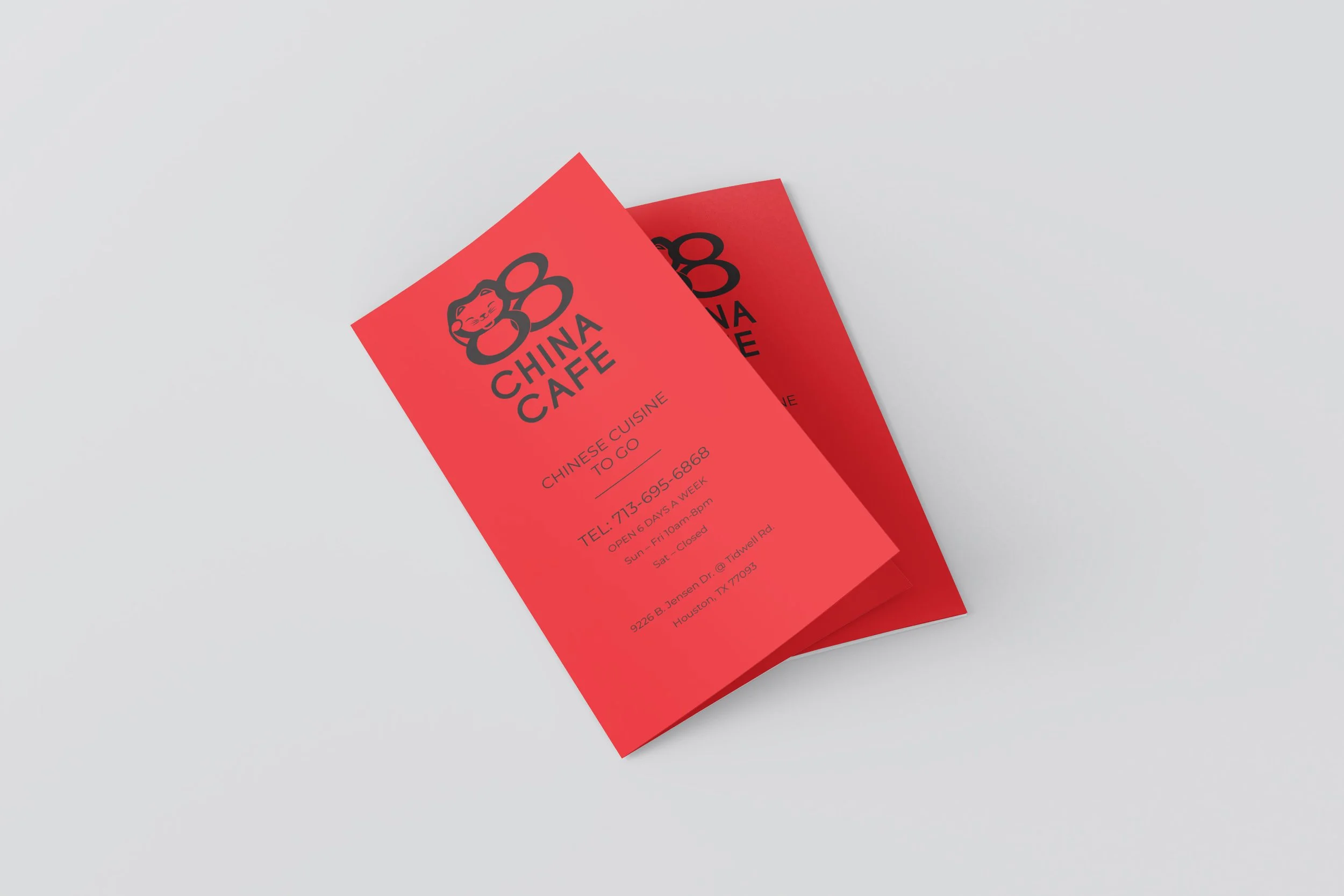
Created a new logo incorporating the number 88 and a lucky cat icon to reflect cultural symbolism and attract customer attention.
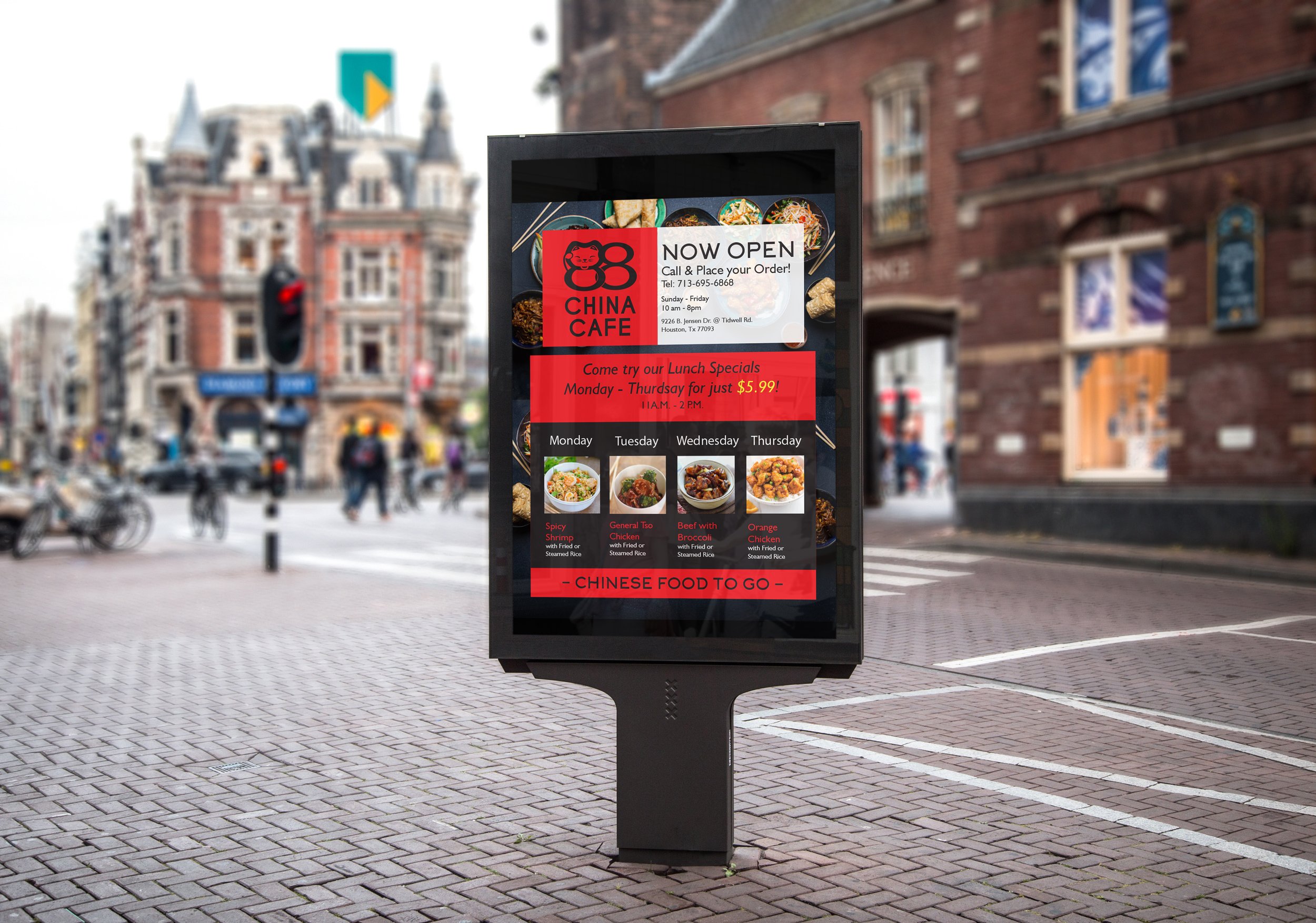
Extended the visual identity system into complementary materials, including e-poster with consistent color, typography, and branding elements.
-
The final solution delivered a visually engaging, easy-to-navigate menu that significantly improves the ordering experience. The brand identity system establishes a cohesive presence for the cafe, enhancing customer recognition and giving the restaurant a modern yet culturally respectful look.


Concept Sketches